Rop plays out a tired design

Photo provided by 9to5toys.com.
November 9, 2015
1 star
✫
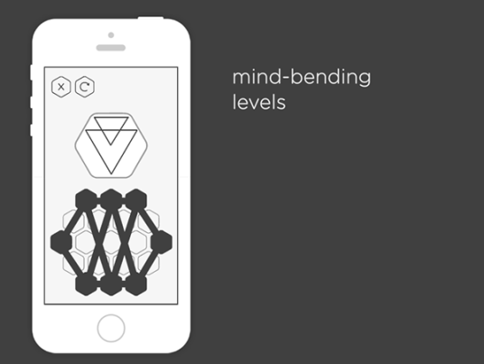
The app Rop may be aesthetically-pleasing, but as the old saying goes, “it’s what’s on the inside that counts.” Although the design peaks users’ interests, its content is lacking.
When the player opens the app to see beautiful shapes and simplistic lines and text, they’re put in a daze. It boasts a minimalist design that’s definitely eye candy, but that’s the only thing going for it.
Rop’s goal is to try form lines that create a shape matching the one presented to you. It’s an elementary idea that has you breezing through the first 10-20 rounds waiting for an actual challenge.
The very ideals the game is built off of are tired, and the game can be found in numerous other apps, especially a very comparable one: the aa series. While the aa series provides a variety of different versions of a basic game, Rop leaves you bored and ready to delete it off your iPhone. The app aa provides some diversity in their games, while Rop provides only one option, and a bland one at that.
Rop gives users an easy experience. If you want to raise your self esteem you should definitely try it, but look elsewhere to test your intelligence and problem solving skills. This game is made for a toddler, not someone who’s old enough to own a smartphone.
In layman’s terms: beauty comes with a price. Although viewers’ eyes may be happy, their brains won’t be. The developers can clearly design but they can’t produce an app to keep players interested after the first 15 minutes. Even though the app’s image is strong, there are many games with stronger content and the same caliber of design.
Want to try the app out for yourself? Download it from the App Store here: https://appsto.re/us/Az315.i


